12 Mar Boulder Home’s Elegant Modernization: Befores + Afters
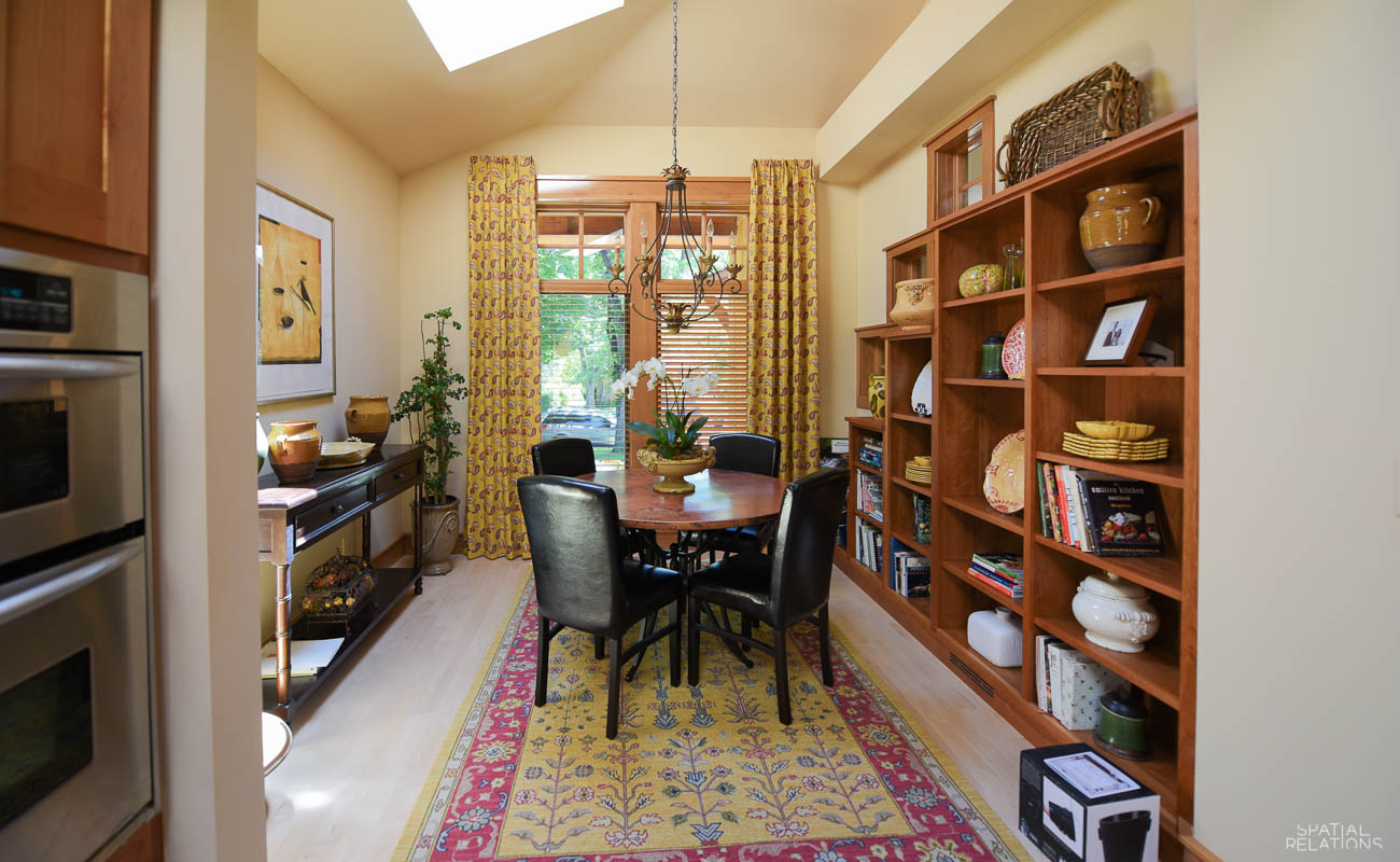
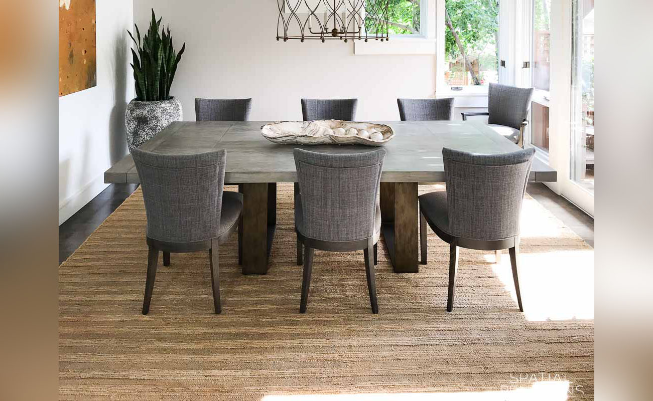
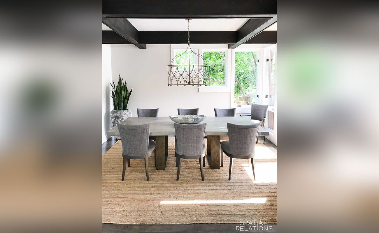
Our clients—newly empty nesters had moved to Boulder, Colorado from a traditional east coast and corporate lifestyle and wanted to update their dining room. Yes, we found a table and that they fell in love with, but knew, that alone would not create significant change in the feel of their home.
Modernization isn’t just a matter of furnishings: it’s about opening space. Unburdened by “stuff” you no longer use, need, or love. Then color, texture, and lighting become drama in the home because you can actually see the space.
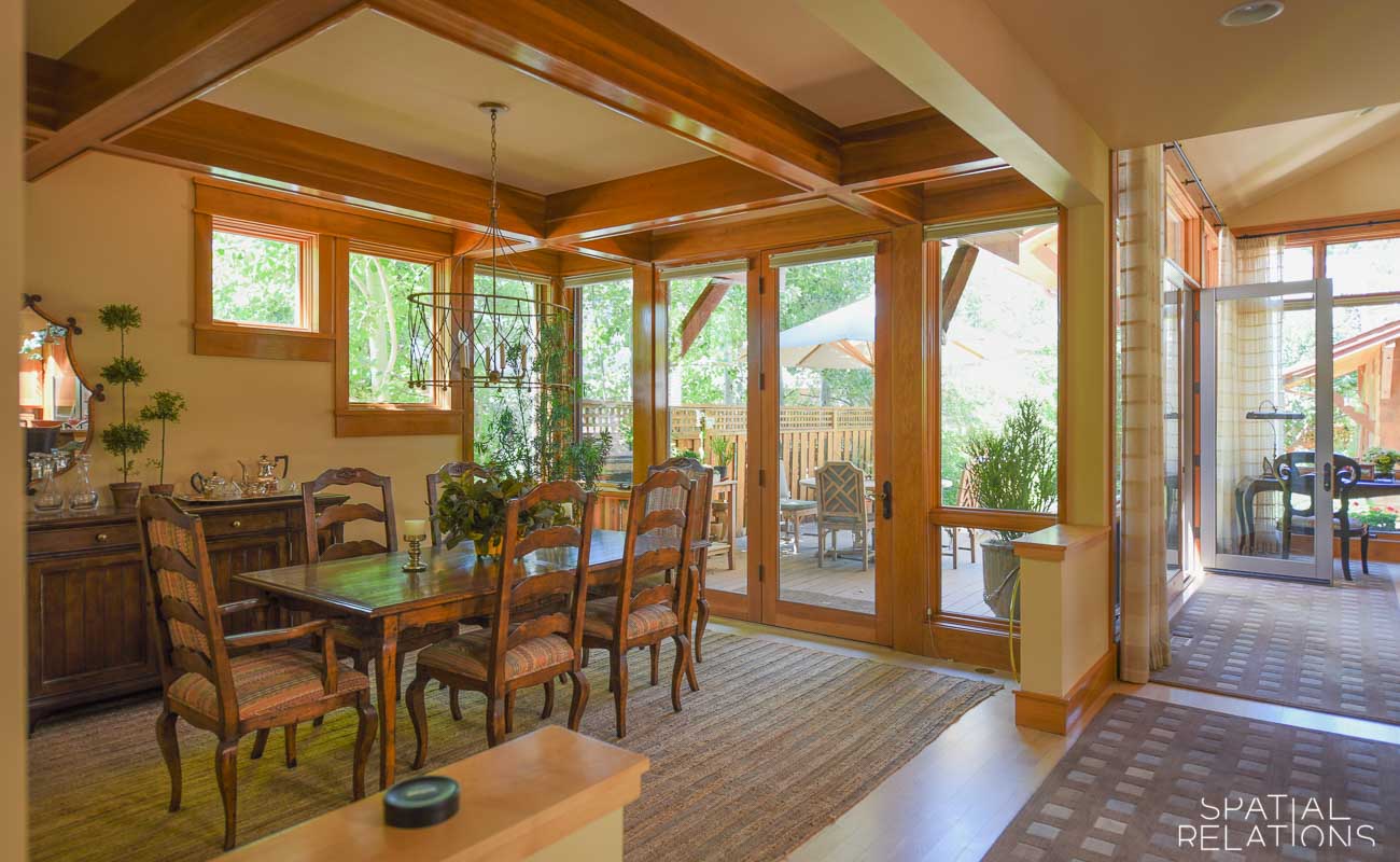
The principal transformation came by rejecting the efforts to present a “traditional home” with divisions of space and emphasize the homes innate, yet hidden open plan.
Modernization isn’t just a matter of furnishings: it’s about opening space. Unburdened by ‘stuff’ you no longer use, need, or love. Then color, texture, and lighting become drama in the home because you can actually see the space.
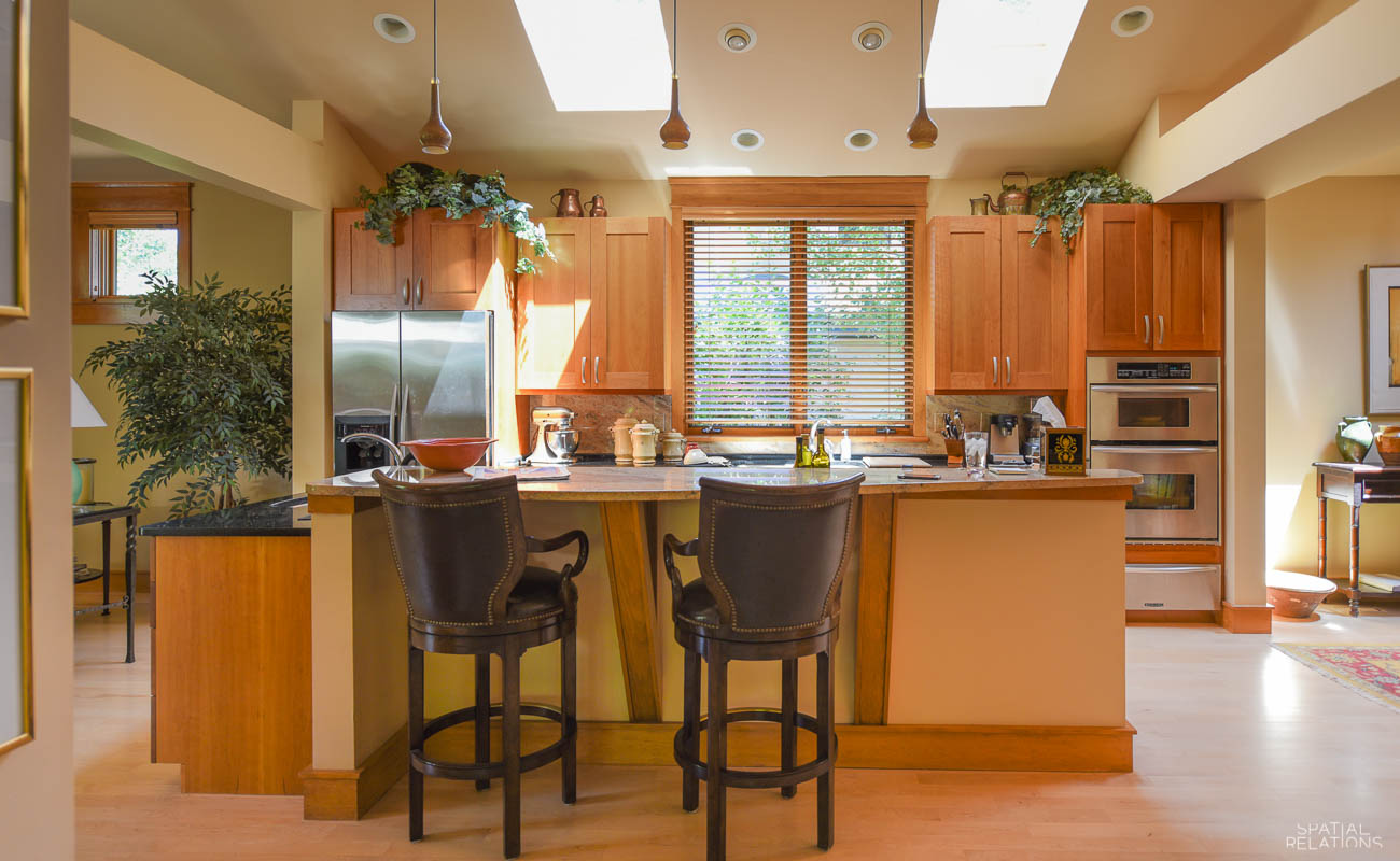
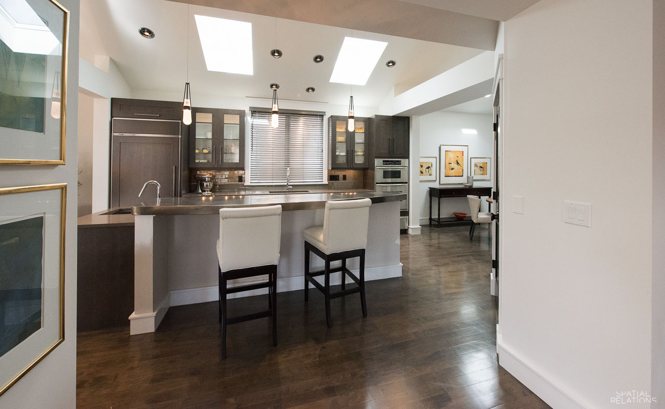
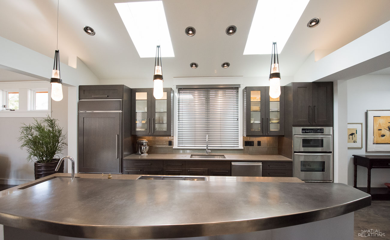
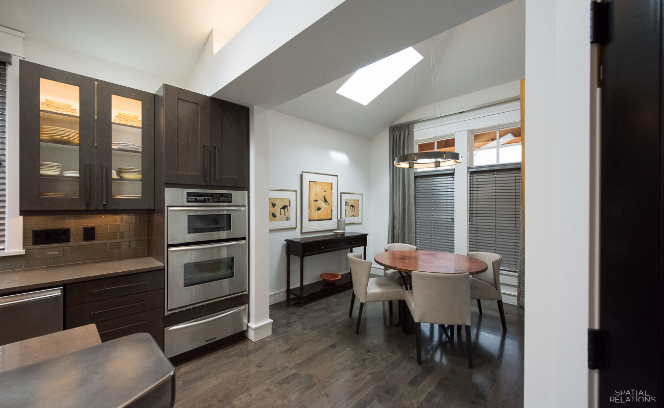
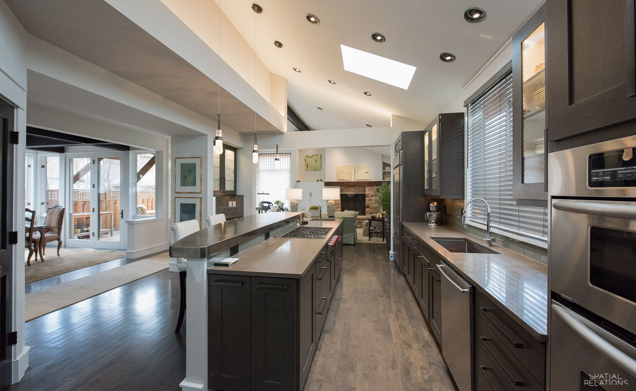
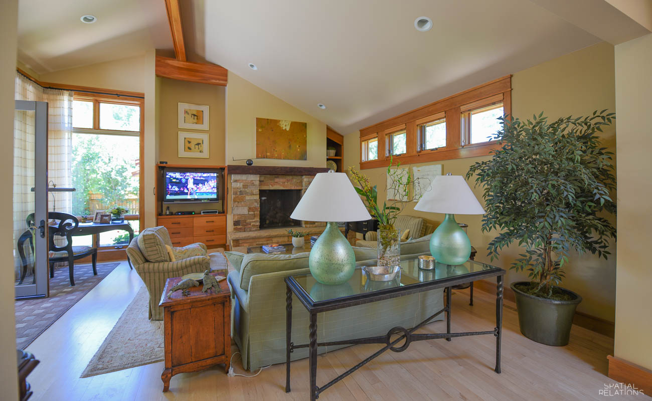
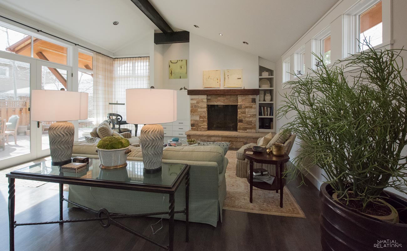
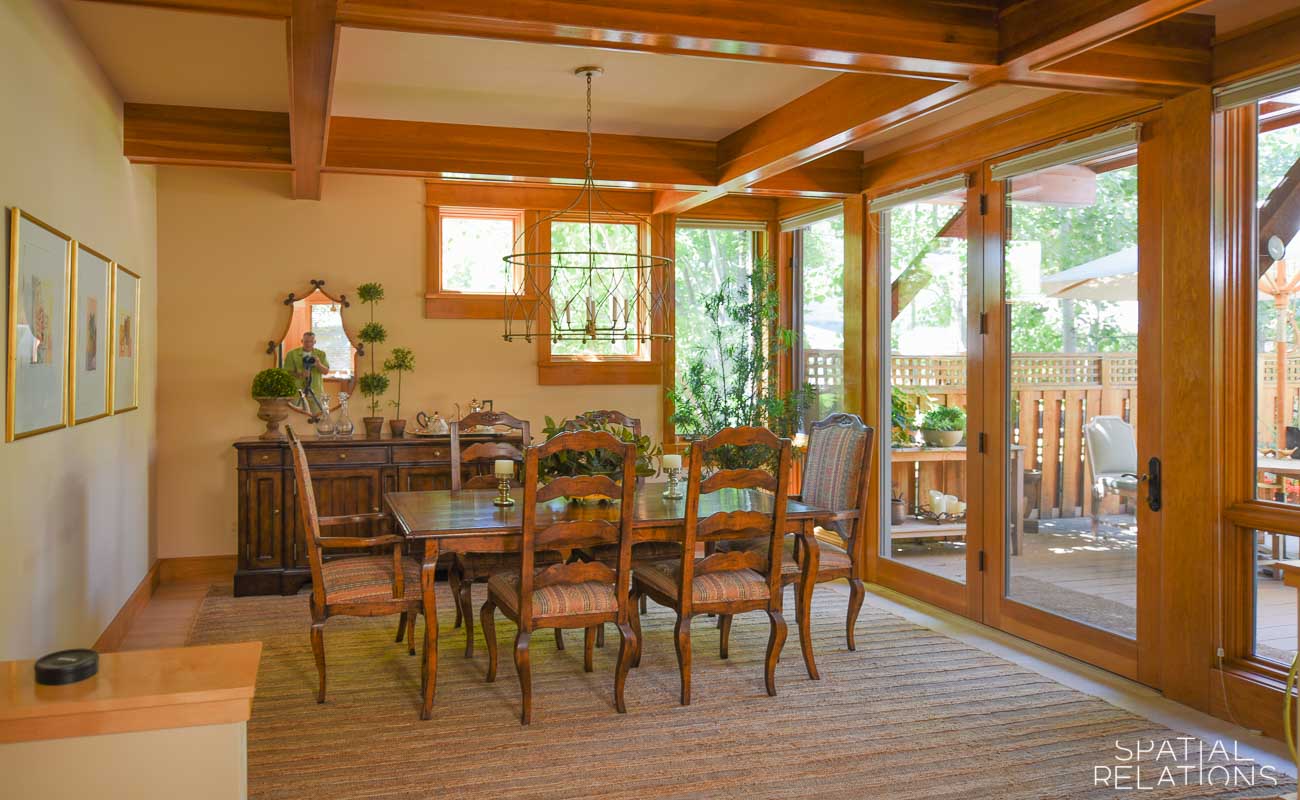
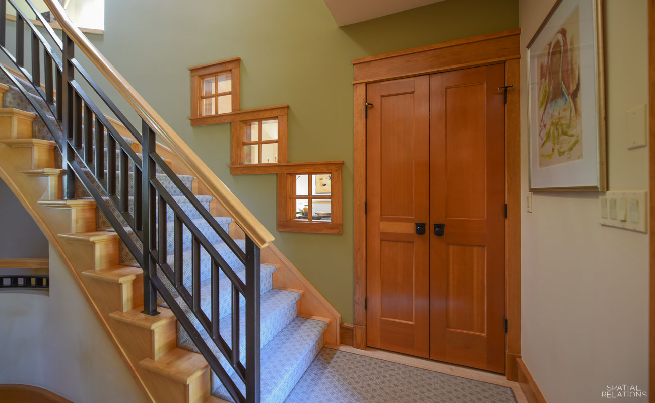
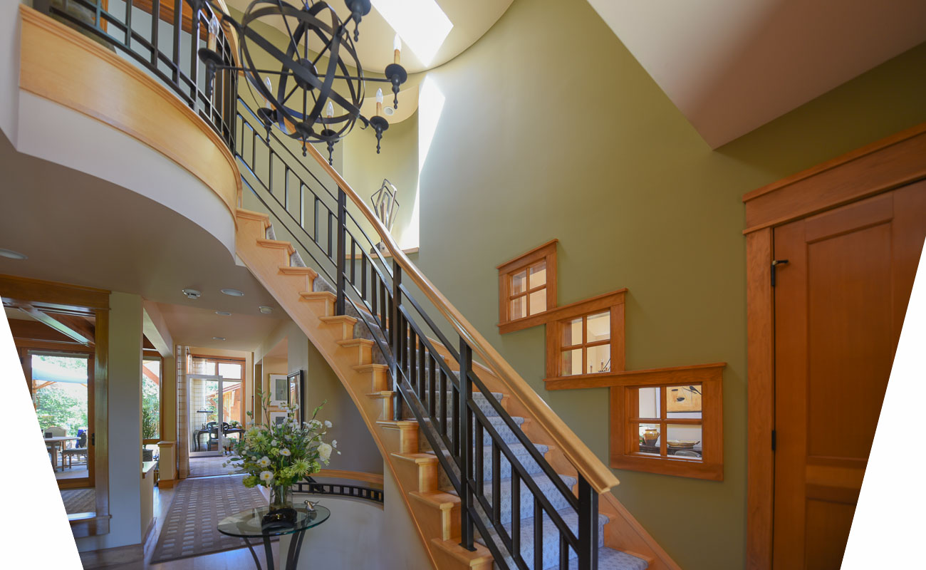
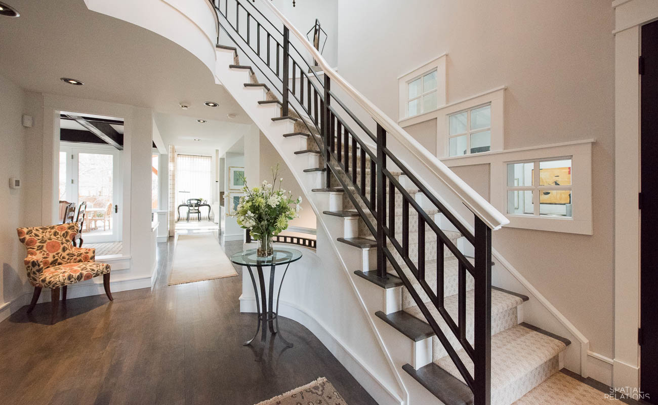
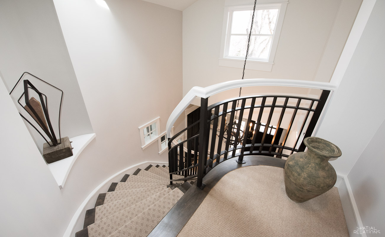
The original kitchen cabinets were Cherry, with no hiding the dated look they created. The Cherry was also carried into the woodwork throughout the house. Fortunately, the house had good bones, with architectural features: high beams and clerestory windows, in the living room and stairwell. We knew simplifying the “riche wood” distractions and dramatizing the architecture with light and shadow would successfully achieve a clean look. The woodwork became white, the kitchen cabinets were refaced with roughhewn white oak doors and a graphite stain. The refrigerator, a key distraction in any small kitchen, was replaced with a Subzero integrated counter depth model, paneled to match the cabinets giving the kitchen a warmth and connection to the adjacent family room living area.
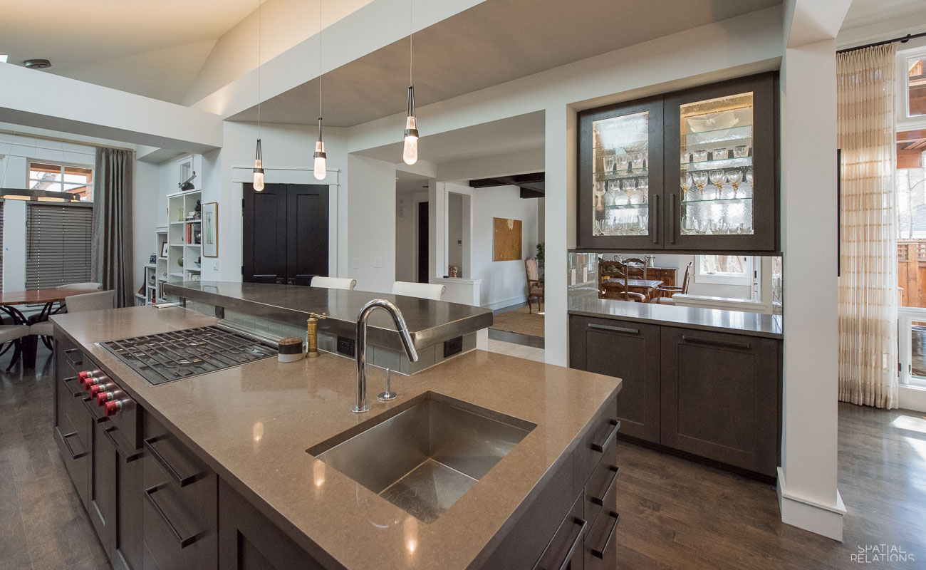
The center island of the kitchen needed some drama. Which we created with a floating 10 foot elliptical pewter patina island by Francois & Co. The subtle gold undertones of the pewter, create glamour contrasting the Laguna Blue Caesar Stone of the kitchen counters.
We highlighted the soffits on the ceiling with led up-lights: Sometimes, the biggest expenses in renovations can come from technology updates, but we have learned that is money well spent since it sets the tonality of the space.
The original flooring in the house was maple. To increase the drama once the woodwork was white, we gave the floors a basalt stain. We also painted all of the doors and the beams in the house black. Radical? Yes, but you can see for yourself the effect.
Notice, too, that the draperies in the breakfast room and living room are wool, by Pollack. Their simplicity and softness create a feminine counterpoint to some of the more masculine lines and textures in this home. We are about to suggest new furnishings for the living room, but one can appreciate the difference made by painting woodwork white, and walls in subtle tones of white and gray.
We can hardly wait to continue the renovations upstairs. The stairs themselves have now become not just a substantial conduit between floors but a theatrical feature in the entryway.


Sorry, the comment form is closed at this time.